Data Visualisation - Making Data Easy to Digest
Good graphical displays of data communicate ideas with clarity, precision, and efficiency.
Bad graphical displays distort or obscure the data, make it harder to
understand or compare, or otherwise thwart the communicative effect
which the graph should convey.
With a solid foundation in data visualisation techniques, you can
ensure your audience grasps the insights from your data correctly and
quickly.
Course Objectives
To integrate storytelling with data presentation: construct your narrative before you design your data display.
To challenge your existing
thinking about how you present your data. Create data displays that
speak to your audience without written translation.
To give you the confidence to grow your data visualisation capabilities and apply them within your organisation.
Who should attend?
People attending this short course come from all backgrounds and organisation types.
The course is suitable for both those responsible for presenting data
and those who must consume data to make management decisions. The only
mandatory requirement is that you have a desire to present or be
presented with data in an insightful manner.
We will introduce you to readily available tools you can use to further your data visualisation journey.
Enrolment Information
Dates:
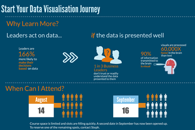
Friday, 14 August 9am-12:30pm – FULL
Wednesday, 16 September 9am-12:30pm
Location:
147 Pirie Street, Adelaide
Level 1
Room 114
Fee:
$300 plus GST
For a total cost of $600 plus GST, attendees can participate in a one
on one session with Steph where we apply course objectives to your
specific data.
Contact:
Steph Jeuken
email: steph@oztrain.com.au
mobile: 0429 040 733
To view a larger version of the infographic click here:
http://oztrain.com.au/wp-content/uploads/2015/07/September-Data-Visualisation.png